
Devil’s Canyon: The devil is in the detail
Tasks
Concept & Direction
Naming
Design
Final artwork
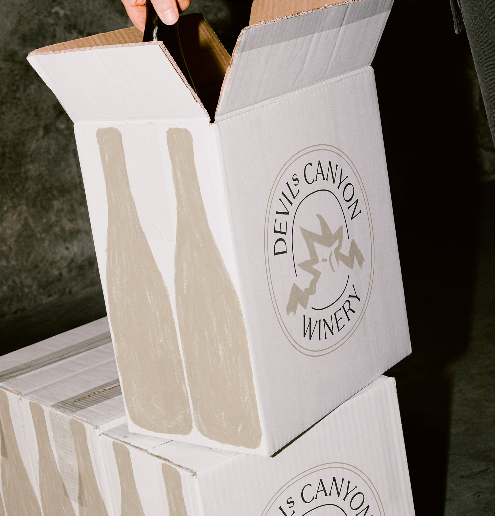
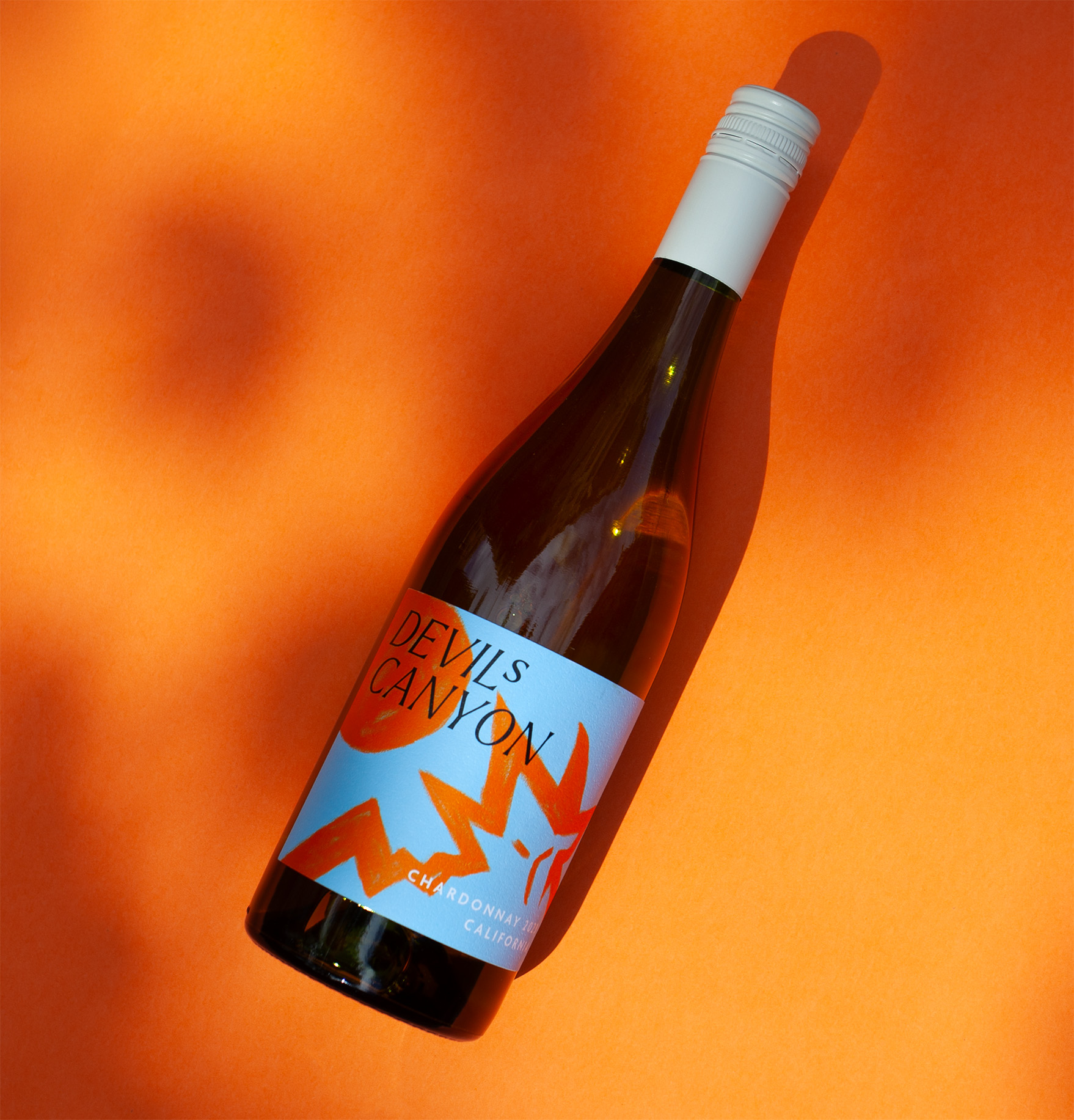
A design that plays with symbols of rebellion and temptation. As the saying goes, the devil is in the details. Hidden in the hills, the devil reflects the temptation and allure often associated with wine.
Just as the devil represents the will to defy conventional order, this label design seeks to break free from the constraints of traditional wine labels.
The vivid colour palettes suggest taste and personality. The eye-catching, expressionist design—marked by rough, enlarged brushstrokes—evokes a sense of something wild and untamed.
It’s a composition that attracts the curious eyes of target consumers seeking new experiences.
SLET IKKE DENNE BOX (fungerer som padding!) – Gallery start
Similar projects


Brewing on an idea?
Cooking something fancy? Let’s talk!
Say hello at mille@servedstudio.com
Or let’s just connect for now:
linkedin/mille-damgaard